Japanese Title (邦題): 「相対的色彩美感覚!」末尾に
Relative sensation!
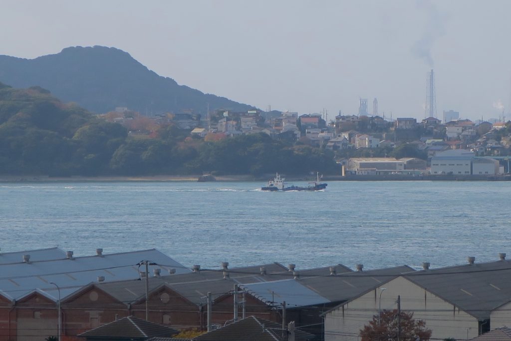
Good morning to the World and Kanmon!
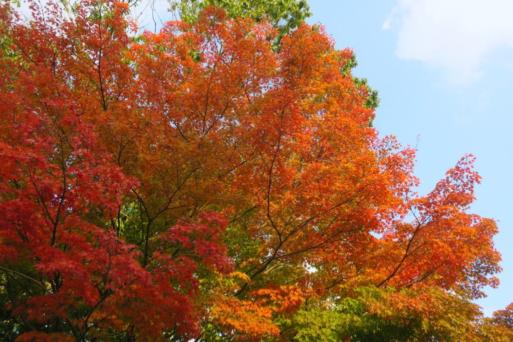
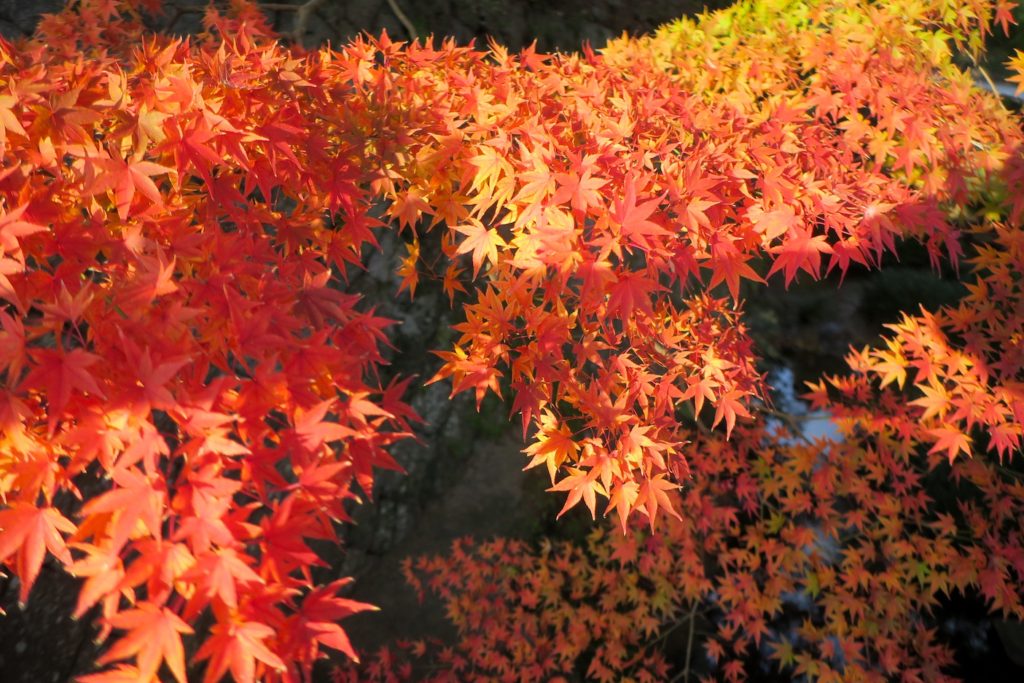
Diversity is needed in coloring, I found.
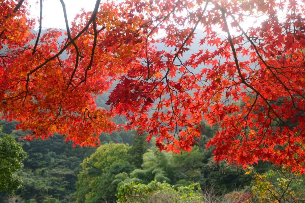
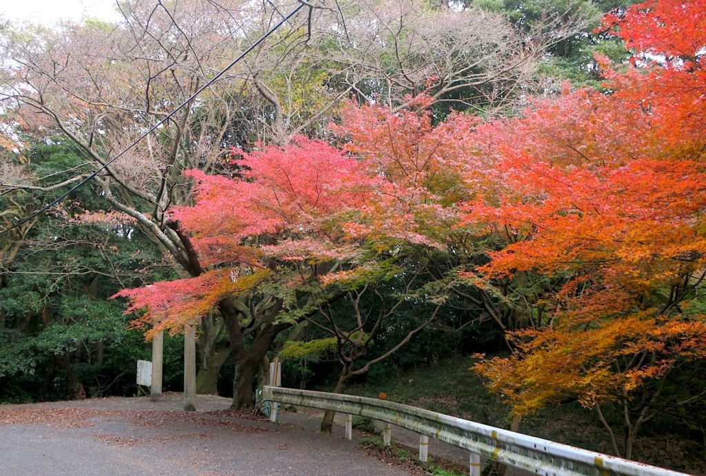
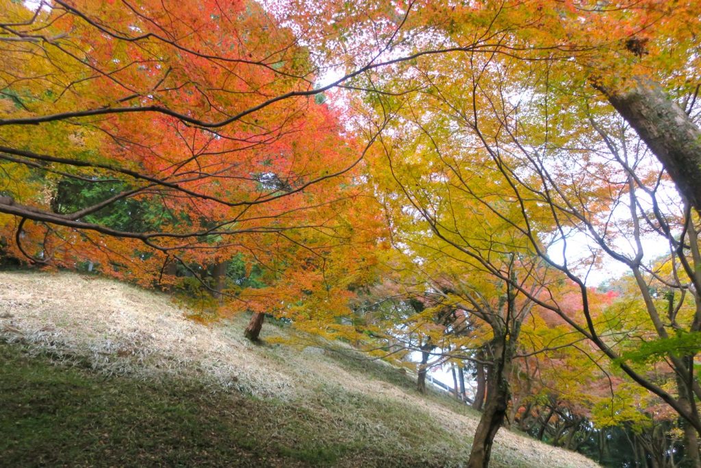
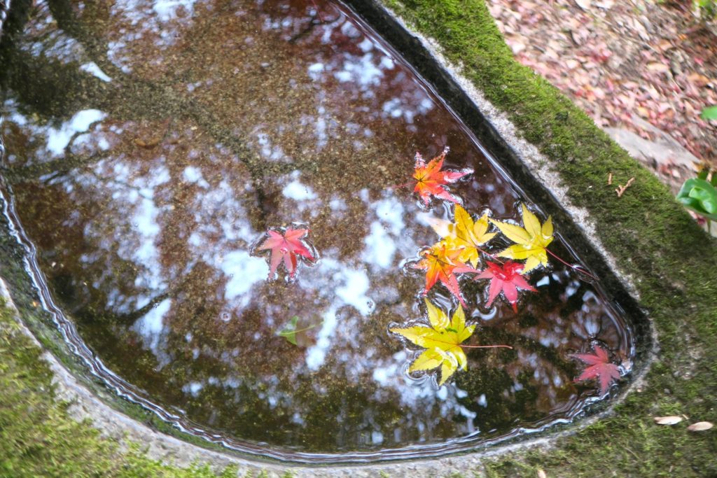
I visited different autumn leave spot from that of the last article. Now is the very best season there.
What I felt, with watching colored leaves, was
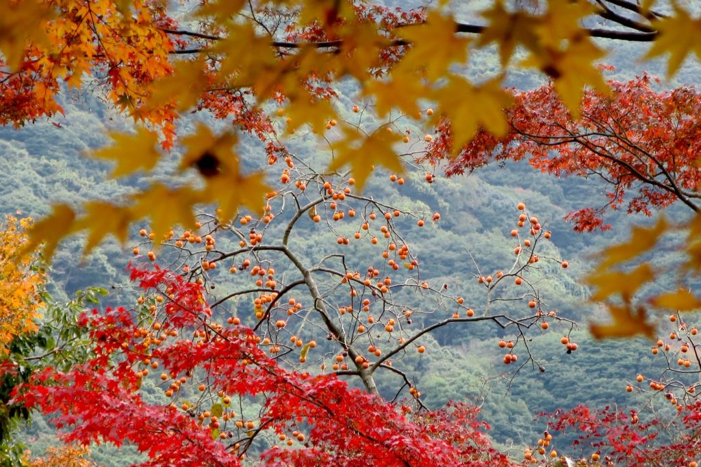
that autumn color is vivider with green, the opposite color.
Specially yellow, vermilion and red become very vivid.
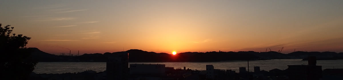
Same time, I did feel that it is like the life and sense of happiness.
Thank you and you have a nice day which is vivider than usual.
from Yassan,
Manager of a Little Guesthouse under a Little Lighthouse TOUKA
( http://touka-kanmon.com )
相対的色彩美感覚!
世界中に朝が、そして関門にもあさが来ました。
おはようございます。
色にも多様性が必要だと実感しました。
今回は前記事とは違う紅葉スポットをチェックしてきました。こちらはかなり見頃です。
色づいた紅葉を見ながら感じたのは、、、
秋色に染まった葉だけを見るよりも、反対色の緑の葉との対比があるほうが、見映えがするなぁということです。
特に黄色に朱色や赤色は際立ち方が違います。
なんか、人生やしあわせの感覚と似ているなぁと感じます。
それでは、どこか際立つ素敵な一日を!
灯台下のちいさいゲストハウス「灯火」宿主 やっさん より
( http://touka-kanmon.com )